Display packaging boxes do more than hold a product. They broadcast your brand, frame the item, and make shoppers stop. Get them right and you win attention and sales. Get them wrong and you leave money on the shelf. Below are the most common mistakes to avoid—and what to do instead—when creating display packaging that works.
Skipping Research and Strategy
Jumping straight into design without a plan is risky. Know who you’re talking to, where the box will live, and what action you want a shopper to take. Study competitors on the same shelf. Identify your key message and a single visual “hero.” Strategy first, mockups second.
Overloading the Design
Clutter kills clarity. Too many colors, fonts, badges, and claims create noise and fatigue. Keep it simple. Limit your palette, use no more than two type families, and give elements breathing room. White space is not empty—it guides the eye and makes premium designs feel premium.
Weak Hierarchy and Tiny Type
If the main message can’t be read from six feet away, it’s not working. Establish a clear hierarchy: brand, product, key benefit, and a compelling callout. Use high contrast, larger type for critical info, and avoid long blocks of text. Design for quick scanning under store lighting.
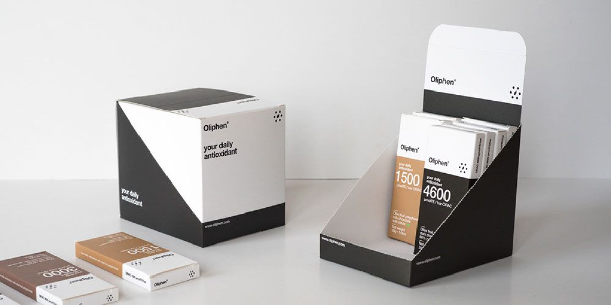
Choosing the Wrong Size or Structure
A beautiful box that doesn’t fit the product or the shelf won’t sell. Pick a structure that secures the item, stands straight, and survives handling. Consider weight distribution, peg holes, and how the box will be opened. Work with structural engineers early to prevent sagging, tearing, or wasted space.
Ignoring the Retail Environment
Design changes with context. End caps, countertops, club stores, and boutiques all have different rules and viewing distances. Photograph the real shelf and test your design at scale. Plan for multi-SKU “billboarding,” anti-theft devices, and store-specific constraints like hooks, trays, or shippers.
Low-Quality Files and Wrong Color Mode
Blurry photos and off-brand colors undermine trust. Use 300 dpi images at print size and vector logos. Design in CMYK (or specify Pantone) instead of RGB to avoid color shifts. Calibrate monitors and request printed proofs when color accuracy matters. Consistency builds brand recognition.
Missing Dielines, Bleeds, and Safe Areas
Printers need precise dielines. Always extend backgrounds past the cut line (at least 1/8 inch or 3 mm bleed) and keep text inside the safe area. Mark fold, glue, and perforation lines clearly. Double-check panel orientation so nothing prints upside down after assembly.
Overlooking Materials, Finishes, and Sustainability
Your substrate and finish affect both cost and perception. Uncoated boards feel natural but smudge easily. Matte coatings look elegant yet can scuff; gloss pops on shelf but can glare. Choose materials that match your brand and shipping needs. If sustainability is a value, say it simply and truthfully, and avoid mixed, hard-to-recycle builds.
Poor Barcode and Compliance Planning
If a barcode won’t scan, stores will reject it. Keep UPCs flat, uncoated, and with quiet zones around them. Avoid placing codes on curves, seams, or high-gloss varnish. Include required symbols, legal text, and multi-language info as needed for your market. Better to plan than to relabel later.
Skipping Prototypes and Real-World Testing
On-screen approvals aren’t enough. Build a physical mockup. Shelf-test it next to competitors. Drop it, shake it, and ship it. Check assembly time on the packing line and make sure the opening experience is intuitive. Small tweaks now prevent costly reprints and returns.
Forgetting Budget, MOQs, and Lead Times
Special finishes, multiple spot colors, or complex die-cuts can blow up budgets and timelines. Design within production limits and ask about minimum order quantities. Lock specs early, batch SKUs where possible, and plan ahead for peak seasons. Reliable availability beats a fancy finish you can’t reorder.
Not Partnering With Your Printer Early
Your print partner can save you from avoidable mistakes. Bring them in at concept stage to review dielines, substrates, and finishing options. A team like Boxprintingforless can advise on cost-effective structures, color management, and approvals so your display packaging boxes look great and run smoothly in production.
Neglecting Calls to Action and Digital Touchpoints
Packaging is media. Add a clear benefit-driven callout and, where appropriate, a QR code for instructions, reviews, or a limited-time offer. Use trackable links to measure engagement. When your box continues the story online, you turn impulse interest into repeat customers.
Inconsistent Brand Elements Across SKUs
Shoppers scan patterns, not products. Keep consistent logo placement, color systems, and type scales across variants. This creates a billboard effect on shelf and speeds recognition. Build and follow a packaging style guide so every new SKU strengthens the brand, not dilutes it.
Overlooking Accessibility and Legibility
Design for everyone. Use sufficient color contrast, avoid tiny reverse type on dark backgrounds, and don’t rely on color alone to convey meaning. Clear icons, simple language, and readable fonts help more shoppers choose confidently—and reduce support issues later.
Conclusion
Great display packaging boxes are clear, sturdy, and brand-right. They guide the shopper’s eye, survive the real world, and make buying feel easy. Avoid the common mistakes above by planning first, simplifying your message, respecting production realities, and testing in context. When you collaborate early with an experienced printer—such as Boxprintingforless—you protect your budget, speed up approvals, and ship packaging that sells. Invest in a thoughtful process now, and your product will stand out on the shelf for all the right reasons.